Moorcore Interiors: How to Create a Wuthering Heights Inspired Home
- Mar 23
- 6 min read
Few films have inspired me visually the way the Emerald Fennel's "Wuthering Heights" has. And when I say "inspired", obsessed, haunted, and more like "I can't focus on anything else" is more like it. Its moody interiors perfectly embody the moorcore aesthetic, which made me want to explore how that atmosphere can translate into modern spaces.
Production designer, Suzie Davies, built an emotional landscape where architectural styles overlap, textures sit against gloss and latex, and rough stone meets slick tile. The result? Dark romance moorcore, drawing inspiration from what many of us now associate with the English moors. Think wind-swept landscapes, earthy palettes, layered textures, and interiors that feel slightly untamed, yet romantic.
And you don’t have to go full Victorian manor to achieve it. It’s about designing rooms that feel storied and personal. Let’s explore how to translate that Wuthering Heights–inspired moorcore atmosphere into your home today.
1. Embrac Emotional Color
One of the most powerful design choices in “Wuthering Heights” is the visual tension we're introduced to between the two homes.
At the Wuthering Heights home, the palette is elemental and storm-washed, pulled directly from the moors themselves. Charcoal skies, moss, earth, weathered wood. The tones feel raw and protective, shaped more by the landscape rather than decoration.

But at Thrushcross Grange, everything becomes sort of surreal. Blood reds, light pinks, soft blues, and glowing warmth create a dreamlike contrast to the harshness of the moors.

Together, these homes tell our favorite story of yearning. One is wild and instinctual. The other refined and romantic.
How to translate this into your home:
Anchor your home in grounded, earthy tones:
Deep brown-black (softer than true black)
Mossy green
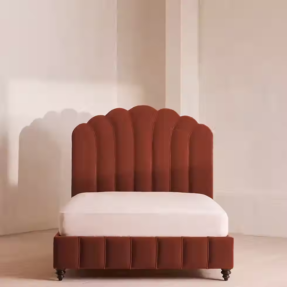
Oxblood or muted plum
Clay and ochre
Chalky bone
Then introduce moments of emotional color in smaller, intentional ways:
Oxblood-red accent chair
Velvet pink pillows
Muted blue upholstery
Warm glowing lighting that softens strong color
Plum throws or moody artwork in a neutral living room (I highly recommend Melissa Mary Jenkins art for moody landscapes)
My favorite way to do this right now is with Lulu and Georgia's velvet pillows, especially the Sangria color.


The layering creates depth, mimicking the same emotional push and pull that makes the film feel so immersive.
Start with a moorcore foundation that is calm and grounded, then allow one or two rooms to become more expressive and romantic. This contrast allows your home to evolve rather than feeling themed or forced.
2. Add a Dash of Gloss and Shine
Many of the surfaces in “Wuthering Heights” are purposefully reflective and liquid-like.
In Davies’ own words:
“We wanted the whole environment to feel really wet and sweaty and moist… like even the walls were sweating or crying.”
This approach modernized the historical setting and supported the emotion of the film. You see it in moments like these:
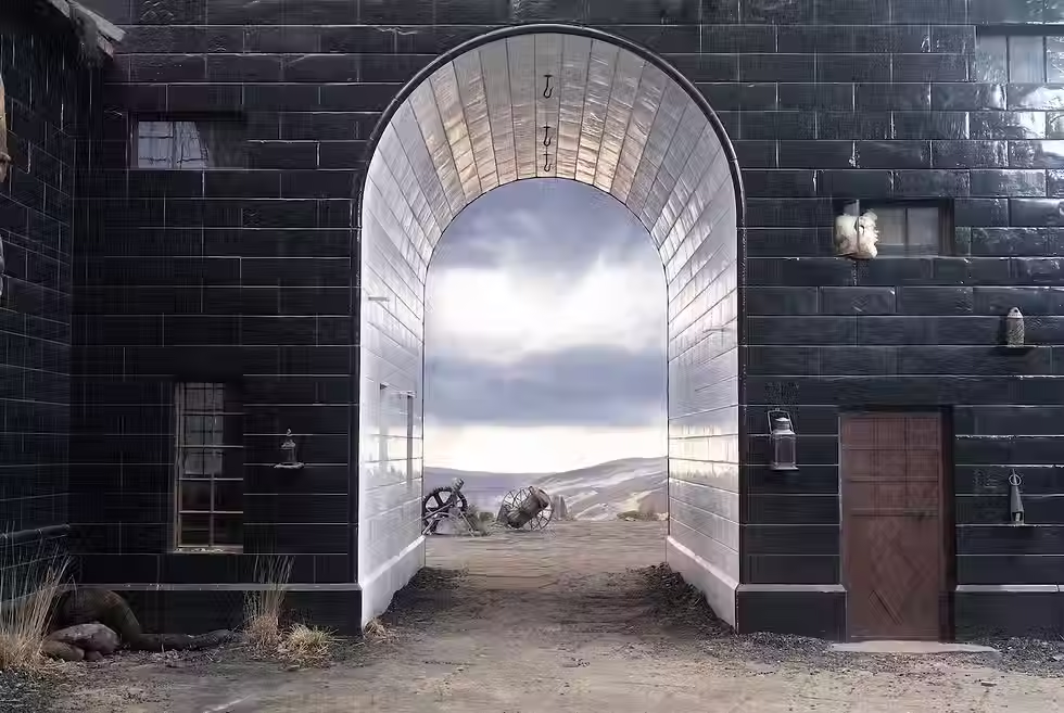
The glossy black tiles covering the Wuthering Heights house.
Condensation in Catherine’s latex skin room.

High-gloss blood-red floors in the Thrushcross Grange’s library.

These reflective surfaces create a dramatic contrast with the raw textures that define moorcore interiors, like stone and wood. This can be applied by introducing moments of shine and romance against matte textures like plaster and linen.
Where to bring this into your home:
Kitchen
Deep glossy tile backsplash in moss, oxblood, or inky blue
Lacquered cabinetry
Polished stone or marble paired with rustic wood
Living Room
Marble coffee table or side table
Ceramic vessels with a subtle sheen
Glossy tray layered with candles and books
Antique mirrors with imperfect reflection
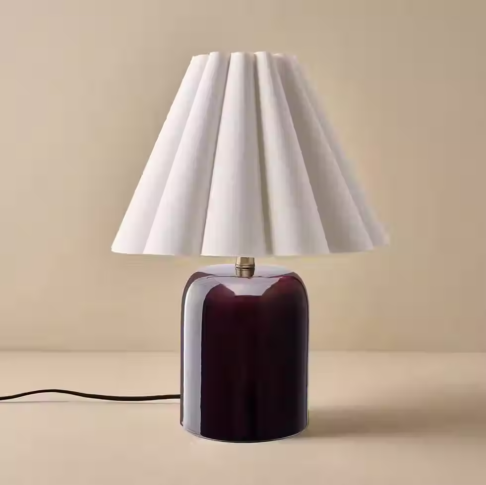
Bedroom
Silk or satin bedding accents
Sculptural lamp with a glazed base
High-sheen frames or jewelry trays
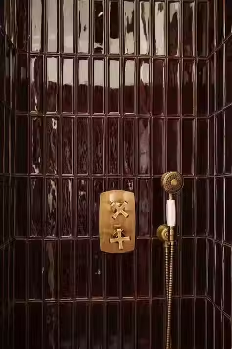
Bathroom
Reflective shower wall or vanity backdrop
Deep glazed tile
Polished marble layered with textured towels

Other ways to add shine (without tile):
Glazed ceramics
Glass lighting
Antiqued mirrors
Brass and unlacquered metals
Silk, velvet, or satin textiles
The point here is that you can start small. And one easy way to do that is antique gold frames on a nightstand with candles. The reflective surfaces of the gold and glass play well with the moody candle light.


Magic happens when these surfaces sit beside something raw, defining both dark romantic interiors and moorcore design. When softness and drama coexist, a room begins to feel alive.
3. Layer Architectural Eras
You either love it or hate it, but one of my favorite parts of this film is how time feels blurred. Interiors don’t belong to a single era, which you'd typically see in a period piece. Instead, the spaces span history.
This approach is central to both the film and moorcore design, where rooms feel shaped by time, weather, and memory rather than strict decoration.
Plus, an original Charli XCX soundtrack? I live for this. But back to design...
Layering eras keep dark romantic interiors from feeling overly gothic or themed. The goal is not historical accuracy, but emotion.
In your own home, this might look like:
A contemporary sofa paired with an antique side table
A modern rug layered beneath a worn traditional one
Clean walls contrasted with ornate mirrors
Sleek lighting beside something weathered
A high-gloss floor paired with antique furniture
Or opt in for touches of decor that represent a period of time. In"Wuthering Heights", hand motifs are used throughout, such as the hand molded fireplace and candle holders in Thrushcross Grange’s library. These not only represent the sensual themes of possession in the movie, but are also a common decor choice of in the Victorian era.

When everything is too polished, a space loses soul. Refinement and wear is what creates richness. Soho House does this beautifully. And if you love that, check out Soho Home to bring their decor to your own home. Some of my favorites:

If you’re unsure where to begin, start with one anchor piece, like a wood chest, an antique picture frame, or sculptural table. Then build around it with modern comfort.
Over time, your home will feel collected rather than curated, which is a defining trait of moorcore interiors.
4. Choose Texture Over Pattern
Texture is the primary language in this film. Director, Emerald Fennel, makes every surface invite touch beautifully. Linen, wool, velvet, plaster, latex, and aged wood create a quiet sensory richness that feels deeply comforting.
This tactile layering is another reason the film resonates so strongly with moorcore, which prioritizes natural materials and weathered surfaces over decorative patterns.
In the film we see this through:
The glossy black tile structure of Wuthering Heights
Catherine’s latex-covered skin room
The glittering background of Thrushcross Grange’s blue room
Texture softens the drama and keeps the space grounded.
In a bedroom this might look like:
Layered linen bedding in tonal shades
A wool blanket folded casually at the foot of the bed
A velvet cushion adding depth
A worn rug grounding the room


In a living room:
Heavy linen or wool drapery
Textured ceramics or hand-formed vessels
Mixed upholstery with both soft and structured materials
Rather than adding more, choose fewer pieces with deeper presence, like a single textured element to create more impact than multiple decorative objects.


The goal is intimacy and for a room that feels meant to be lived in, not simply looked at. Once you capture this feeling, I promise even something as simple as a glass tray can feel romantic.
5. Turn on Romantic Lighting
In the film, light behaves more like emotion and shadows become part of the composition.
The effect is cinematic but also grounding like the slower, atmospheric mood of the moors.
Instead of relying on a single overhead light, layer lighting intentionally:
Table lamps at different heights
Floor lamps creating warm pockets of light
Wall sconces casting soft directional glow
Candles (even when unlit) for visual warmth
I like to use fake candles on timers so you don’t even have to think about it. Lighting like this encourages slower evenings, softens the nervous system, and creates a sense of refuge.


6. Let the Room Feel Slightly Undone
Perhaps the most important lesson from these interiors is that romance lives in imperfection. That’s why a weathered antique can sit next to a modern sofa in the best way possible.
This makes it so there is a sense that life is happening within the space.
Try allowing small moments of looseness:
Books stacked casually instead of arranged
Throws draped rather than folded
Wood furniture showing wear
Meaningful objects even if they aren’t “perfect”
An ornate vintage mirror beside something modern


Let your home evolve slowly, collect pieces over time, and leave space for change. This approach also reduces the pressure to complete a room, but allows your home to grow with you.
The Well Placed Perspective
Dark romantic interiors aren’t about drama for drama’s sake. They’re about designing a space layer by layer.
Whether you consider it inspired from the "Wuthering Heights" moors themselves or not, these spaces are shaped by landscape, memory, and emotion. When a home holds that much story, it feels alive.


Comments